Friday, December 30, 2005

Flavor

or Flav-ugh
flava
Blech!...talk about leaving a bad taste in your mouth! I'm not a fan of those "reality" shows, but I accidently happened upon this most distasteful spectacle one day and almost lost my lunch. Of course that's FlavaFlav and Bridgette Neilsen swapping spit.

Friday, December 23, 2005

Holiday

Happy Holidays to everyone at Illustration Friday!
holiday_frog2
This was done a few weeks ago for a friend. She is a symphony violinist who also runs a summer strings program for serious middle and high school kids. The frog by himself is the standard logo I did for her a few years ago, so when she asked me to do a HOLIDAY card for her, putting the frog in a snowglobe was the perfect solution. The whole thing was done entirely in Photoshop.

Friday, December 09, 2005

Surprise

w_flip
This image was done as a demo for one of my illustration classes. It's just a silly piece that really has no agenda, but it lends itself to any interpretation one might want to put on it. I call it "Bush be Nimble", and it's the expression on some of the onlookers faces that makes it fit the theme.

Friday, December 02, 2005

Blue

beaux_arts
Chalk pastels on sandpaper pastel paper.


Blue, too...
blake_blue
A page from my sketchbook which was (unusually) done in blue and white on gray paper.

Sunday, November 27, 2005

Small

JazzCat2
I'm short on time this week, so here's a small jazz fan that I did a few years ago.

Saturday, November 19, 2005

Free...variations on a theme

The good
liberty
"Give me your tired, your poor,
Your huddled masses yearning to breathe free,
The wretched refuse of your teeming shore.
Send these, homeless, tempest-tost to me,
I lift my lamp beside the golden door!"

The bad
OJ
Free, but why?

The ugly
m_tyson
Free (for the moment)

Friday, November 11, 2005

Strength

strength
They say that gram-for-gram, ants are among the strongest creatures around. This is for those of us who are small in stature but with the inner strength that it takes to accomplish mighty things. I like that idea... the rhino doesn't.
For a step-by-step of this piece, go here.

Thursday, November 10, 2005

Strength step-by-step

Step 1:
1
The ant was done several years ago for a company that makes pesticides. It was done in acrylics with airbrush and traditional brushes. I played with the scale and position of the ant until I found a relationship that looked like it would work...I know the ant is much too big in relationship to the rhino, but the ant is the hero, and it needs to be large enough to see, so I took some artistic license with scale. The rhino was drawn using photo reference found online. Of course, there were no photos that were from the correct angle, so this guy is a conglomeration of many. I did this drawing in Photoshop using a Wacom Intuos II 9X12 tablet. The sketch layer was moved to the top of the stack and the blending mode was set to "Multiply" so that it's visible from every layer under it (Multiply makes the dark marks visible, but the white areas [the background] become transparent).
elephant_rhino
For reference I also used these sketches from a trip to the zoo; they came closer to the angle I was after than any of the photos I could find.

Step 2:
2
The sandy ground was done on a new layer at the bottom of the stack. I filled the area with a sandy beige color, then I used the linear gradient tool and did a gradient of dark khaki to transparent from bottom left to upper right; the gradient blending mode was set to multiply.
I wanted the texture to be obvious in the foreground but fade as it recedes into the distance, so I pressed "Q" to enter Quick Mask mode, dragged a gradient from upper right to lower left to mask off the upper right area, pressed "Q" again to create a selection of the un-masked area, and ran the texturizer filter using sandstone as the texture.
The sky was done by drawing the shape with the pen tool, changing the path to a selection, filling the selection with a sky blue, then using the radial gradient with a very light blue to give the impression of a sunny day.


Step 3:
3
The rhino was done in several stages: the head was one layer; I made a tracing of the sketch with the pen tool, changed the resulting path to a selection, filled the selection with a neutral gray, and then used the brush tool and a variety of brush configurations to paint in the textures and details. The foreleg and foot were on another layer, and the surface textures were on yet another layer; I'm a big believer in layers because they offer so much flexibility.

Step 4:
4
Next come the horns, which were done exactly like the head, but on a new layer.

Step 5:
5
The ear is next; rhino ears are very strange, and kind of cute; they remind me of a waffle cone that's been rolled up, before the ice cream goes in. I then added a shadow for the ear on a layer below.

Step 6:
6
The rope comes next. I thought about drawing the chain going all the way around the horns, but the grays and blues of the chain were too close in color to the rhino's horn and might have gotten lost, so I chose to attach the chain to a rope, instead. The rope was traced with the pen tool, converted to a selection, then filled with a yellowish, "ropey" color. The braids were done with the brush tool and the same yellowish color set to multiply mode.
I also wanted to give the appearance that the feet were being dragged through the sand, so I created a new layer and added "dust" coming up from his feet, and in front of his chin and leg.


Step 7:
7
The chain comes next. I created a new file and drew two links that were the largest size I would need. After I was happy with the color and the metallic nature of the links, I dragged them to the rhino art. There, I went to Edit>Transform>Distort, and shaped the links to fit the angle and the perspective correctly. Then I hit Command-J to copy the transformed links to a new layer. I then hit Command-T to go into transform mode on the new links and adjusted them to the proper size and position so that they lined up in the correct position, scale and perspective relative to the previous links, and repeating this process until the chain was complete. The ant was copied onto a new layer and was transformed (squished) to a shape that would serve as a shadow for the ant; the shape was moved to it's proper position, then I command-clicked the layer icon to make a selection of the shape, and filled it with a cool gray. I used the blur tool to soften the shadow in appropriate areas.
The ant needed some "footprints" at this point, so I added those as well.


Step 8:
8
The final step was to copy the completed chain onto a new layer and turn it into a proper shadow for the chain to cast onto the ground; I used the same procedure as I used for the ant shadow above. The ant shadow and the chain shadow were placed on the same layer, and the blending mode was changed to multiply and the opacity was reduced a bit to allow the texture of the ground to show through. And that's that.

Friday, November 04, 2005

Night

Cat_moon
Some of you may have seen this before. It was done recently for a book cover that is yet to be published. It's all Photoshop, save for the initial sketch which was good 'ol pencil and paper. The big blank spot on the moon is for the title.

Friday, October 28, 2005

Broken

broken_small
bro·ken
Pronunciation: 'brO-k&n
Function: adjective
Etymology: Middle English, from Old English brocen, from past participle of brecan: to break.

There are dozens of definitions of the word broken, each offering a different opportunity for illustration. Most have a negative connotation, but I chose to look at broken from a more hopeful angle, as in having broken free from some restraint, or perhaps from a bad situation. I will leave it up to you to interpret this image as you wish.

Saturday, October 22, 2005

Remote

remote4
While on what was to have been a routine reconnaisance mission, Major Blunder found himself hopelessly lost when the guidance system failed on his F-3487and3/4 Intergalactic Fighter. Nearly out of fuel, and needing to go to the bathroom REALLY badly, he made his way to the only solid ground within range. When he finally emerged from the cramped cockpit of his broken ship, he found himself on a strange, remote planet. The first thing on his mind was "I gotta take a leak". The second thing was "I wish I could paint happy trees like Bob".

Below is v3.0; same as above but without the RGB video projectors beaming across space. Don't know why I didn't think of that earlier on...oh well, better late than never, I suppose.
remote3


Below is v 2.0 (same as above but without the bazillion inch TV)
remote_2

Below is the first version...
remote
These were done digitally with a combination of photos (the remote controls), Bryce4 for the basic planets, mountains, sky, etc., and Photoshop (CS2) and a Wacom tablet for the details, type, etc. The intergalactic fighter plane, the Major Blunder figure, and the other drawn elements were invented.

Friday, October 14, 2005

Cold

More_Bitter_than_Death
A recent book cover piece that fits the theme nicely. The original art just showed a crack in the ice, but I wanted it to feel even colder, so I added a little something to give you a chill. This was painted from scratch in Photoshop.

tongue
This is another idea I had, and since I saw no others that addressed this angle on the "cold" theme, I decided to do a quick graphite drawing. Growing up in the South, where freezing weather is a bit of a novelty, it was easy to get kids to do the "lick the flagpole" trick, and then revel in their stupidity as they stood there with their tongues hopelessly frozen to the metal. Of course, it was the bullies who perpetrated such evil...I would NEVER do such a thing.

Sunday, October 09, 2005

Lost


I've been battling a nasty bug all week, so I regret posting another non-original piece.
This was a book jacket done in acrylics on illustration board, but it needed a little more drama so I digitally added the reflection of the couple on the bridge looking down into the water.

Friday, September 30, 2005

Float(s)

I have a couple of images that work for this week's theme:
float

And now for something completely different...
cokefloat
(please forgive the use of previously done work...the time thing, you know)

Sunday, September 18, 2005

Escape, part two

fly_away_home
I was going through some old work and came across this piece that also seemed appropriate for this week's theme. It seems to have many layers of meaning, but I'll let you all decide what it means to you.

Friday, September 16, 2005

Escape

escape
Sometimes what we escape to is infinitely worse than what we escaped from.

Friday, September 09, 2005

Depth

Depth
There is nothing deeper than a child's imagination...children have no concept of "impossible". The idea that you can't dig a hole to China never crosses their mind...give 'em a bucket and a shovel and off they go, ready and willing to dig and dig until they get there. Wouldn't it be great if we could keep that sense of destiny and can-do spirit throughout our lives?

Friday, August 19, 2005

Reflections

Asa
Too busy to do a new piece for this week's theme, so I submit a book cover I did a while back.
I've done several pieces that use reflections as a metaphor for other things, but that seems too easy. Here, I chose a piece whose lack of reflections tells the story...the main character has died and is reflecting upon his wasted life, but as you can see, there are no reflections in the water, just a bottomless abyss that represents the void that his death has left in the lives of his friends and family.
Acrylics on illustration board.

Monday, August 15, 2005

Wisdom

"Knowledge speaks, wisdom listens"- Jimi Hendrix
wise_ jimi
I never thought of Jimi Hendrix as being exceedingly wise, but as I was looking around for inspiration for this "wisdom" theme, I stumbled upon this quote from him, and it struck me as being one of the most sublime definitions of wisdom I'd ever heard. Who knew?...maybe all those psychedelic drugs did help him find enlightenment, after all.

Monday, August 08, 2005

Empty

empty-nest
This image came to me immediately when I learned the theme was "empty". I did a few quick sketches in my usual realistic style and it just didn't work. So, I tried this simplified vector style, and it seems to have the right feel for this image.

Friday, July 29, 2005

Aging

cancer_color
I drew this self portrait two years ago after I was diagnosed with skin cancer. It manifested itself as a bb sized freckle under my right eye. I didn't give it much thought until one day, as I was washing my face, it started bleeding. I got a biopsy and was (mildly) relieved when the doctor said it was basel cell...the "good" kind of skin cancer.
I underwent Mohs' surgery, which is supposed to be the most non-invasive form of skin cancer surgery. I was a bit surprised that such a little lesion would require so much cutting and stitching...I felt a little like Frankenstein as I changed the bandages a few days after the surgery. It's the price I am paying for a childhood spent outside in the sun every summer with no sunscreen at all...back then we didn't know what UV was, much less what it could do to you. We just tried to get the deepest, darkest tan possible, sunburn be damned!
The scar has heeled now, and I'm the only one who notices it, of course.
I posted this "before and after" sketch in hopes that it will help all of us to be more conscious of the time we spend in the sun, and to pay attention to even minute changes in our skin...it can mean the difference between life and death. Luckily for me, it was just minor surgery, and a subtle daily reminder every time I look in the mirror.

Friday, July 22, 2005

Tranquility

OOPS! To go to "Aging", click the "Drawrings" masthead at the top of this page.
tranquility_small
I didn't have time to do a new piece this week, so I hope this will suffice. It's from a book cover I did a while back, and the image has always felt dreamlike and tranquil to me. If you'd like to see the original book cover version, it's right here.

Friday, July 08, 2005

Designer Babies

Designer Babies
A look at what might happen if that "Designer Baby" doesn't turn out exactly as planned.

Metropolitan

metropolitan
Some of you (older folks) will get it, some of you won't.

Friday, July 01, 2005

Sport

Lance_painter
Congratulations to Lance Armstrong on his unprecedented 7th consecutive Tour de France victory. Vive la Lance!

Friday, June 24, 2005

Heroes

tuskegee
The Tuskegee Airmen of WWII were real-life heroes. They faced down the advancing German Army and prevailed in the skies over North Africa and Europe with one of the best combat records in history. But the Germans weren't the only enemy they faced and defeated; they fought during a time of intense racial prejudice, but they proved themselves more than worthy to fight alongside anyone. Because of their bravery and skill as fighter pilots and soldiers, the Tuskegee Airmen won the respect of a nation and the world.

This illustration was done as an in-class illustration demonstration. I used a little of everything: Watercolor, acrylics, oils and colored pencils. And, a touch of Photoshop at the end.

For a step-by-step on this piece, go here and scroll down.

Sunday, June 19, 2005

Lemur step-by-step

This is a brief step-by-step of how I made the lemur piece for Illustration Friday's "Black & White" theme.
1.lemur_photo
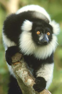
This is the reference photo I used; it was published online, and I hope it is a public domain image; there was no copyright notice on the image, so I hope it's ok to use ; ).

2.sketch
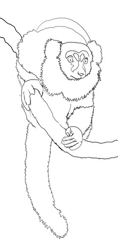
I added some area to the bottom of the canvas to accomodate the long tail, and sketched in the basic shapes using a Wacom tablet; I use a small, 3 or 4 pixel soft brush to draw with in Photoshop. If you want it to look like graphite, you can add texture and a little noise in the brushes palette.

3.shapes
Next, I added a layer at the bottom of the stack and filled the top area with black and the bottom with white. Then, I made a new layer above that one for the basic shapes; I used the lasso tool and roughly drew shapes for the black and white areas and filled the selections with the appropriate color. I wanted a stark black and white abstract pattern at this point, so I made the selections as simple as possible while still maintaining the essence of the lemur.

4.fur_details
Now comes the fun part. I used a small brush and the Wacom tablet and painted with white to create fur along the edges of the shapes I had defined earlier. For smaller, more random fur, I used the brush that is normally used for creating blades of grass, and after tweaking the settings in the brushes palette, I came up with a reasonable simulation of fur. I also used the smudge tool a bit to soften some of the fur.
For the face and hands, I used various shades of gray to bring out the details, painting with small, soft brushes; I lower the opacity and flow settings to get as much control as possible. Still, I was not too concerned with precise details, as you can see below...

5.eyes
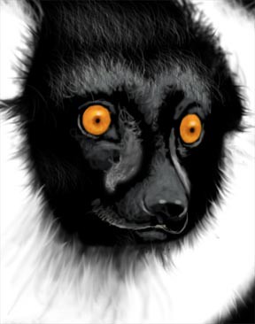
The details of the face are quite impressionistic and loose; I just wanted to get enough detail to capture the expression on the lemur's face.
The eyes were done on a seperate layer; I used the lasso tool to create selections for the eyes and filled them with an orange that was a touch more saturated than the photo. I added pupils and a catchlight using a small brush and the Wacom tablet.
You can see in this close-up where the smudge tool comes in handy for softening the fur, especially under his chin.

black&white
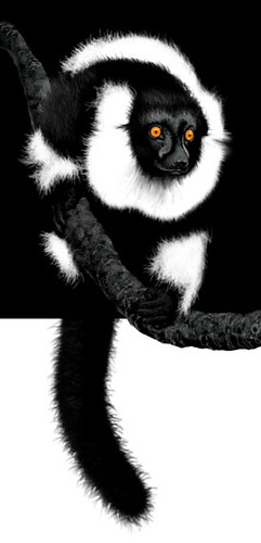
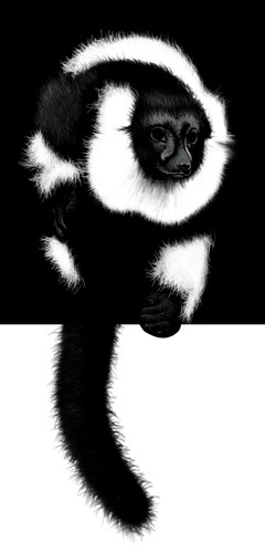
And, again, here is the finished piece. The details in the hands got lost in all the darkness, but that's okay...it adds to the mystery that I was shooting for.

Friday, June 17, 2005

Black and White

black&white

The first idea that popped into my head was Michael Jackson, you know, before and after. But, that's a tired story, and just too pathetic to address. So, I thought of natural things that are black and white, and of course the usual suspects were considered, such as zebras and skunks and magpies, but for some reason I suddenly thought of a lemur; a very elegant and formal looking creature with just enough color to make it visually startling.

Friday, June 10, 2005

Summer

Bop

I don't have time this week to create a new work, so I offer this piece that was originally done for the cover of a book called "BOP".