I am teaching a watercolor illustration course this spring, so I wanted to try a piece or two using his suggestions, and I'm very happy with the first trial piece...
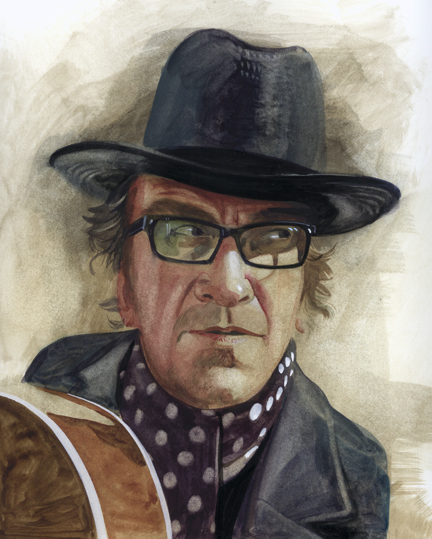
Two things make this technique different from traditional watercolor; the surface is 3-ply Strathmore Plate Bristol paper. Very slick surface, harder than hot press watercolor paper. The colors slide on the paper and don't penetrate so deeply into the fibers, which means you can lift colors off to reveal the lighter areas of the image with a moist paper towel or a damp brush. The second thing is the addition of a bit of opaque white gouache to add a bit of haze, or semi-transparency to the color. It tends to deaden the vibrancy a bit, and makes things feel less garish than purely transparent colors can be. It will take lots of paintings to really get used to the feel of the paper, and to learn what can and can not be done with this technique, but so far, I'm pleased and intrigued with the possibilities.