
Saturday, October 15, 2016
Monday, February 09, 2015
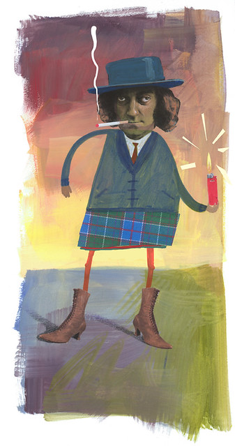
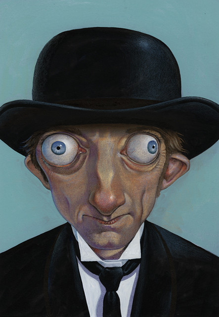
A few new pieces...
 |
| Acrylics on panel |
 |
| Duke Ellington; watercolor and gouache on Bristol paper, for "The Greenbook Chronicles" |
 |
| Muddy Waters; acrylics, watercolors, oil wash and colored pencils, for "The Greenbook Chronicles" |
Wednesday, November 20, 2013
Playing with art supplies.
 |
| Pen and ink with watercolor on illustration board. |
 |
| Watercolor over acrylics on watercolor paper. |
 |
| Same as above with Photoshop. |
 |
| Acrylics over tissue paper on cradled panel. |
 |
| Mixed media on illustration board. |
Friday, May 31, 2013

Tuesday, May 28, 2013
Biker Frog Demo


Biker Frog Demo, a set on Flickr.
A demo I did for my Acrylic Techniques class this quarter; Spring 2013, SCAD-Atlanta Illustration. It involves a technique called grisaille, in which a monochromatic, tonal painting is done first, then glazes of color are added. The technique usually involves oils, but this is all acrylics on a gessoed panel.
Lyle Lovett Demo


Lyle Lovett Demo, a set on Flickr.
A demo I did for my Materials and Techniques 2 class this week; Spring 2013, SCAD-Atlanta Illustration. It's a variation on the layer isolation technique used by many illustrators including Mark English and C.F. Payne.
Saturday, March 02, 2013
A cold day at the zoo
Goni Montes and I have many of the same grad students in our classes, so we all took a field trip to the Atlanta Zoo yesterday. Early March in Atlanta can be really pleasant or really bitter. It was closer to the bitter side, but some of the more robust animals were out in the open and we had a good time despite the chilly weather. Here are a few of the sketches from the trip...


Saturday, June 09, 2012
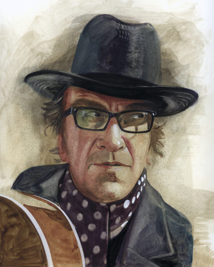
Clapton Portrait
I started this piece several weeks ago as a demo in my watercolor class. It uses Burt Silverman's technique of transparent watercolors and gouache on plate (or smooth) Bristol paper.
The process is quite interesting and allows for an additive and subtractive approach to painting in watercolors, and the results often resemble oil washes rather than watercolors.
10.5 X 13.5"
I know it's a huge jump from stage three to the finished painting, because I failed to document it as often as I should have. Click on the finished version below to see a larger image.

The process is quite interesting and allows for an additive and subtractive approach to painting in watercolors, and the results often resemble oil washes rather than watercolors.
I know it's a huge jump from stage three to the finished painting, because I failed to document it as often as I should have. Click on the finished version below to see a larger image.

Friday, February 10, 2012
Marty Feldman Week
This week I had some sort of a bizarre inspiration to pay tribute to Marty Feldman. For my graduate techniques class, I had them do a collage and transfer piece, so I did a quick demo, not knowing exactly where it was going to take me..that's the beauty of collage and transfer techniques which evolve and morph unexpectedly as the piece progresses. The theme for the assignment was "light", and here's what I ended up with...
Then, a few days later, Goñi Montes' class was about to do a portrait project using a layer isolation technique. He asked me to do a demo of that process so again, I went to my old friend Marty Feldman and drew up a caricature. He's one guy who is an actual, living caricature, so making his eyes look too big and too wacky isn't easy. At any rate, here's how it turned out...
Then, a few days later, Goñi Montes' class was about to do a portrait project using a layer isolation technique. He asked me to do a demo of that process so again, I went to my old friend Marty Feldman and drew up a caricature. He's one guy who is an actual, living caricature, so making his eyes look too big and too wacky isn't easy. At any rate, here's how it turned out...
Monday, October 17, 2011
Steve Jobs illustration
I did a technique demo for my wife's AP Studio class last week using acrylics and watercolors, a la Sam Weber, but without the skill or finesse that Sam has. It's a portrait of Steve Jobs, and I wanted to do an image that depicts him as a visionary, so I tried several ways to call attention to his eyes. Not sure which one works best, but I'm leaning toward the straight portrait with no background or embellishments. Any favorites?
Wednesday, August 31, 2011
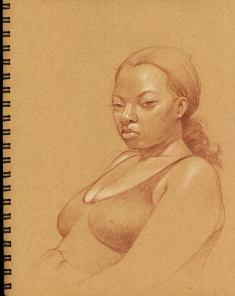
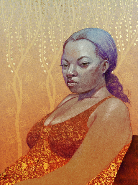
Sketchbook Experiment
I scanned a page from my sketchbook and played with it in Photoshop to see where I could take it. I had been looking at a few Klimt pieces and was inspired to try some digital gold leaf.
Here is the sketchbook scan. The drawing is done with Tuscan Red and Cream Prismacolor pencils on brown craft paper.
Here is the final...
Saturday, July 23, 2011
Yonah Mountain Crush Fest
Here is a recent commission for a North Georgia vineyard called Yonah Mountain, named after the prominent geological feature with exposed granite scars amid the rolling hills of Cleveland, GA.
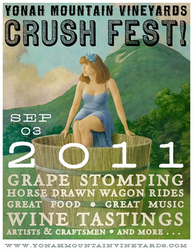
This is the poster; Jeff Holman is the designer and he's responsible for the very nice type design.
Originally, the idea was to create an extreme horizontal that would serve as an outdoor board, as well as a vertical piece that would serve as the poster. So, I had to work in the outdoor board orientation which was 5 feet wide by 2.5 feet high at 300dpi, so it was quite a beefy file. Turns out it won't be used as an outdoor board, but as a smaller scale road sign leading to the event...
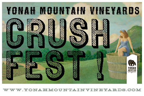
The artwork was a bit richer and saturated than this, but Jeff added a texture effect which reduced the contrast and made it look even more like a vintage piece. I like the result.
This is the poster; Jeff Holman is the designer and he's responsible for the very nice type design.
Originally, the idea was to create an extreme horizontal that would serve as an outdoor board, as well as a vertical piece that would serve as the poster. So, I had to work in the outdoor board orientation which was 5 feet wide by 2.5 feet high at 300dpi, so it was quite a beefy file. Turns out it won't be used as an outdoor board, but as a smaller scale road sign leading to the event...
The artwork was a bit richer and saturated than this, but Jeff added a texture effect which reduced the contrast and made it look even more like a vintage piece. I like the result.
Wednesday, March 23, 2011
Watercolor test piece
One of my favorite artists and illustrators is Burton Silverman. I have a few of his books but they mostly deal with oils and drawing. Then I saw he had a book called "Breaking the Rules of Watercolor", and the images were stunning. It looks more like oils than watercolor, and I was very curious about his process so I bought the book.
I am teaching a watercolor illustration course this spring, so I wanted to try a piece or two using his suggestions, and I'm very happy with the first trial piece...
Two things make this technique different from traditional watercolor; the surface is 3-ply Strathmore Plate Bristol paper. Very slick surface, harder than hot press watercolor paper. The colors slide on the paper and don't penetrate so deeply into the fibers, which means you can lift colors off to reveal the lighter areas of the image with a moist paper towel or a damp brush. The second thing is the addition of a bit of opaque white gouache to add a bit of haze, or semi-transparency to the color. It tends to deaden the vibrancy a bit, and makes things feel less garish than purely transparent colors can be. It will take lots of paintings to really get used to the feel of the paper, and to learn what can and can not be done with this technique, but so far, I'm pleased and intrigued with the possibilities.
Subscribe to:
Posts (Atom)