Your work is as amazing as ever. I hadn't seen the birdcage until today and was amazed with the detail, the light and the execution. And I did find much meaning in it as well. As always, your work gives me chills. Today's jelly fish floating on the water is so perfectly done I wouldn't touch it for fear of getting stung!
Thanks for all the great comments...it's what keeps me a-float. (sorry, it just slipped out)
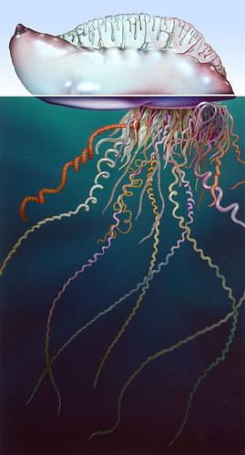
Anyway, Joli, these two pieces were for commercial clients and they were done in acrylics on illustration board. Some elements were airbrushed and some elements were painted with a brush; it just depends upon which tool works best for the effect I'm trying to achieve. The floats (and other elements) were sketched freehand with a pencil, then cleaned up with French curves and templates...I can't draw a perfect ellipse freehand, and I don't know anyone who can. The finished drawings are transfered to the board and frisket is applied over the artwork: frisket is a tacky masking paper for artists. The shapes of the objects to be painted are cut out of the frisket with an x-acto knife so the edges are very sharp and clean. Then the frisket is removed; one shape at a time is airbrushed, and the frisket is replaced over the newly painted area so no overspray can accidently contaminate it. The process is repeated for every area until the airbrushing is complete. Then all the frisket is removed and areas that require hand painting are dealt with as in a traditional painting. Now, of course, airbrush illustration is becoming a lost art since most illustrators are doing the same thing on the computer (see the fishbowl I did for "Escape; a few years ago that would have been an airbrush painting that would have taken most of the day...with the computer and a Wacom tablet I did it in a couple of hours).
Dig the first one of the Portguese man'o'war - really cool and well framed to boot (note to self must start drawing that squid that I've been putting off). The second one is a bit schmaltzy for my liking - but you can't help what the client wants - nicely executed (as per usual).
Extremely technical and thanks for the know how! I love the first image, thought it was a non blue bluebottle, they sting enough with only one colour. However it is a fine and extremely well done Portguese Man'o'war! It's stingers look like mardi gras spaghetti and it's bodies' fullness (enhanced by highlights) looks highly pop- able. It is indeed floating. This is my favourite of your so far :)

18 comments:
i have not seen this two if this are old images. great effects in the floating shell.
i made rootbeer float and i might try ordering this one if i cannot find any rootbeer float.
lovely illos as always.
Your work is as amazing as ever. I hadn't seen the birdcage until today and was amazed with the detail, the light and the execution. And I did find much meaning in it as well. As always, your work gives me chills.
Today's jelly fish floating on the water is so perfectly done I wouldn't touch it for fear of getting stung!
More superb work. Slick technique, shading, highlights. Great stuff, as always from you.
must go get ice cream float now!...such great colors...wow.
your style is great...love the birds and sea creatures too.
how did you do the floats...please share...those shapes are perfectly round...wow
come check out my color use in my blogs -Getting Looks & EGGS...would love your opinion. thanks
Thanks for all the great comments...it's what keeps me a-float. (sorry, it just slipped out)
Anyway, Joli, these two pieces were for commercial clients and they were done in acrylics on illustration board. Some elements were airbrushed and some elements were painted with a brush; it just depends upon which tool works best for the effect I'm trying to achieve.
The floats (and other elements) were sketched freehand with a pencil, then cleaned up with French curves and templates...I can't draw a perfect ellipse freehand, and I don't know anyone who can. The finished drawings are transfered to the board and frisket is applied over the artwork: frisket is a tacky masking paper for artists. The shapes of the objects to be painted are cut out of the frisket with an x-acto knife so the edges are very sharp and clean. Then the frisket is removed; one shape at a time is airbrushed, and the frisket is replaced over the newly painted area so no overspray can accidently contaminate it. The process is repeated for every area until the airbrushing is complete. Then all the frisket is removed and areas that require hand painting are dealt with as in a traditional painting.
Now, of course, airbrush illustration is becoming a lost art since most illustrators are doing the same thing on the computer (see the fishbowl I did for "Escape; a few years ago that would have been an airbrush painting that would have taken most of the day...with the computer and a Wacom tablet I did it in a couple of hours).
Dig the first one of the Portguese man'o'war - really cool and well framed to boot (note to self must start drawing that squid that I've been putting off). The second one is a bit schmaltzy for my liking - but you can't help what the client wants - nicely executed (as per usual).
Detlef
http://www.detlefjumpertz.com
Your work is awesome thanks for explaining how you did it.
Your work is awesome thanks for explaining how you did it.
Extremely technical and thanks for the know how! I love the first image, thought it was a non blue bluebottle, they sting enough with only one colour. However it is a fine and extremely well done Portguese Man'o'war! It's stingers look like mardi gras spaghetti and it's bodies' fullness (enhanced by highlights) looks highly pop- able. It is indeed floating. This is my favourite of your so far :)
Indeed great work. Glad I landed on your site. This week images are excellent.
Find the two on Escape, exceptional.
Paula
old or new, keep sharing. these are both great (as always).
i just saw isay's root beer float a couple of clicks ago, too... now must go get one for sure... yummm.
GREAT blog!! Love your arts ... for float, both are cool, but, I like the top one better. The concept is very unique!
Guauuu very cool GREAT
Wow, really great colors.
Your work is always inspiring, loaded with richness and depth. I always love to admire it, pore over the details and drink it in. Thanks for sharing.
I particularly like the Portuguese Man of war.
Thank you for sharing your talent. I really love your work. I hope to aspire to your level one day.
Wow, your jellyfish (ok, Man o'War or something...) is simply awesome!
Post a Comment