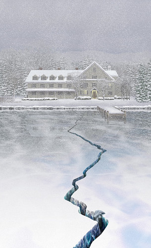
A recent book cover piece that fits the theme nicely. The original art just showed a crack in the ice, but I wanted it to feel even colder, so I added a little something to give you a chill. This was painted from scratch in Photoshop.

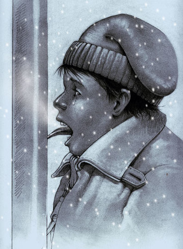
This is another idea I had, and since I saw no others that addressed this angle on the "cold" theme, I decided to do a quick graphite drawing. Growing up in the South, where freezing weather is a bit of a novelty, it was easy to get kids to do the "lick the flagpole" trick, and then revel in their stupidity as they stood there with their tongues hopelessly frozen to the metal. Of course, it was the bullies who perpetrated such evil...I would NEVER do such a thing.
21 comments:
breathtaking!
I hate to employ this word verification device, but so many weirdos and blog spammers are horning in on the fun, there's little choice...sorry.
Very nice perspective. I feel chilly.
Definitely cold and wet. The perspective is spectacular!
This is really lovely a with a sinister edge - excellent
The atmosphere reminds me of the 'Shining' with a dash of one of the'Omen' movies ... Brrrrrrr.
I know nothing of frozen lakes, can they crack like that? This is tooo cold for me - very well done image :)
Just wonderful, make me think of the movie The Shining, with Jack Nicholson...spooky movie.
Tag, you're it....
Joli's blog
Oh wow..I just read Anon's comment...I did not see if before I posted mine. Spooky....Rick this is really a great piece.
Love it! The extra bit you added works perfectly with this picture.
I started a new snow scene, but I didn't feel good about rushing an egg tempera piece so I went with an installation piece from several years ago. You are not "too dim to get it". I like to let my painting speak for itself, and as a wise man recently said recently I'd rather "let you decide what it means to you." (-:
This is very effective. I would have believed it was a painting. What was the book?
You don't need to apologize for using older work. It wonderful to share it with people, and it's still new to us.
Couch; The book is "More Bitter than Death" by Dana Cameron. I've done several titles for her books which are all set in northern latitudes and involve death and cold in some combination. You can see what the printed book cover looks like here.
Your work is simply stunning, Rick. I can't often respond to very many of the obvious professionals that post here because one runs out of things to say so quickly. Anyway, this piece has moved me greatly and I love it. Thanks for sharing such an obviously stellar talent through IF.
i'm in love with your illustration of the lodge next to the lake. That could be here in western montana.
The crack in the ice gives it a somewhat eerie feeling...but i prefer not to look at the crack, and only at the way the snow is settling on the trees and the roof of that lovely lodge.
These are both excellent...and extremely cold! I love the bottom one; I can't believe so many people actually do that:> The top one made me think of our neighbor's driveway that develped a waist-deep, 3' wide gully ysterday after all the rain we've been having. I am really impressed by the incredible control you have drawing oin photoshop...everything is so wonderfully precise. Sych gorgeous work, Rick!
i'm glad i came back to catch bonus work. The composition works even better with the text, and it's a privilege to see both version.
btw. i just read your comment on anonymous. sorry about your school and the printshop.
I wish freezing weather was more of a novelty here, but is very pretty. Winter is fun time for most Newfoundlanders, but I'm more of a summer person by nature. I think fall is the most romantic time of year, and its a pity it didn't last a little longer. The cold is coming too soon, and I wish I could get my baby out in the stroller more.
That is quite a powerful first image. As for the second one-bad childhood move. But very well done!
Well, you nailed the theme with both of these. I can always count on a visual treat from you, and I am never disappointed. You have such a great eye and though you are obviously a technical genius, your work always has a lot of heart and soul too. Bravo!
These are beautiful. You're very talented.
wynlen
Wow! it's a great picture! Love that crack in the ice.
Very nice work!
The two pieces are STAGGERING! These are very accomplished works! Wow! Splendid!
Snow... I can't imagine how you even rendered the snow for the first illustration. Seriously great work!
This is coooool! I like the second one. Nice drawings. Took a look at your www and liked your cats...
Post a Comment