Saturday, July 23, 2011

Yonah Mountain Crush Fest

Here is a recent commission for a North Georgia vineyard called Yonah Mountain, named after the prominent geological feature with exposed granite scars amid the rolling hills of Cleveland, GA.
CrushFest_2011Postcard_PRESS.jpg
This is the poster; Jeff Holman is the designer and he's responsible for the very nice type design.

Originally, the idea was to create an extreme horizontal that would serve as an outdoor board, as well as a vertical piece that would serve as the poster. So, I had to work in the outdoor board orientation which was 5 feet wide by 2.5 feet high at 300dpi, so it was quite a beefy file. Turns out it won't be used as an outdoor board, but as a smaller scale road sign leading to the event...
CrushFestRoadSign_PROOF2.jpg
The artwork was a bit richer and saturated than this, but Jeff added a texture effect which reduced the contrast and made it look even more like a vintage piece. I like the result.

Wednesday, March 23, 2011

Watercolor test piece

One of my favorite artists and illustrators is Burton Silverman. I have a few of his books but they mostly deal with oils and drawing. Then I saw he had a book called "Breaking the Rules of Watercolor", and the images were stunning. It looks more like oils than watercolor, and I was very curious about his process so I bought the book.
I am teaching a watercolor illustration course this spring, so I wanted to try a piece or two using his suggestions, and I'm very happy with the first trial piece...

Elvis_Costello.jpg
Two things make this technique different from traditional watercolor; the surface is 3-ply Strathmore Plate Bristol paper. Very slick surface, harder than hot press watercolor paper. The colors slide on the paper and don't penetrate so deeply into the fibers, which means you can lift colors off to reveal the lighter areas of the image with a moist paper towel or a damp brush. The second thing is the addition of a bit of opaque white gouache to add a bit of haze, or semi-transparency to the color. It tends to deaden the vibrancy a bit, and makes things feel less garish than purely transparent colors can be. It will take lots of paintings to really get used to the feel of the paper, and to learn what can and can not be done with this technique, but so far, I'm pleased and intrigued with the possibilities.

Monday, February 28, 2011

Merry Down Cider transfer demo

This is a technique that involves using acquired imagery such as old engravings, scans and photographs, and transferring them to the substrate using acrylic mediums or acetone, or simply collaging printed materials to your artwork and painting over them with acrylics.
A little background; 
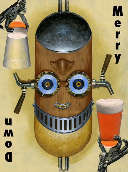
Merry Down is a hard cider beverage from England. Their advertising imagery always involves images that can be viewed right-side-up, or upside-down. Typically, the right-side version shows a happy drinker with a full glass of Merry Down. The upside-down version shows a sad drinker with an empty glass. I've used this idea as an assignment for some of my techniques classes because it involves clever and fun imagery, and necessitates thinking ahead several steps to make everything come out right.
MerryDown_demo.jpg
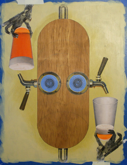
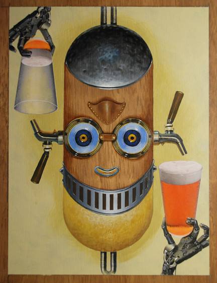
This is the final, after the type was added. I am going to take you through the major steps of this process...

sketch_scan.jpg
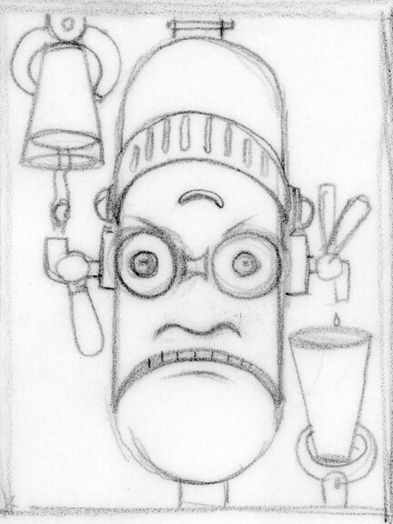
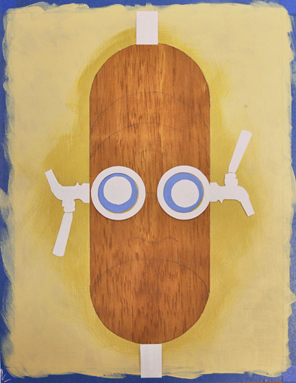
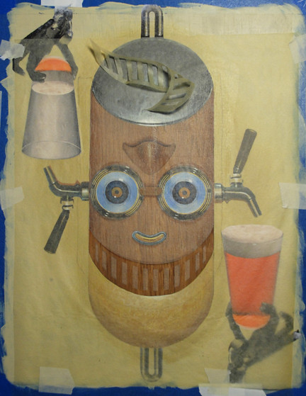
This is the thumbnail I used as a rough guide for the piece. I wanted to keep it a bit unfinished which would allow for a bit of flexibility in the development of the image.

DSC_01.jpg
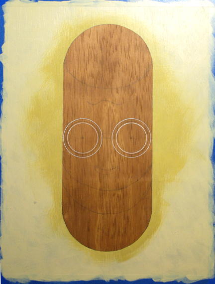
The substrate is a 12 X 16" piece of Luan; birch plywood about 1/4" thick. I "stained" the surface with acrylics and water, using burnt umber and burnt sienna to get a warm walnut color. After lightly sanding the surface, I painted on two coats of Liquitex Matte Medium thinned with a little water. I then transferred the sketch using an Artograph opaque projector. I used a compass to draw perfect curves, by the way.
After the drawing was transferred, I used Scotch soft release painter's tape to tape off the margins, and to roughly mask off the center capsule shape that would be the robot's head; I used the tape to carefully define the sides of the shape, but needed to leave the curved areas at the top and bottom visible, so I cut the tape short in order to see the lines. I used liquid masking fluid to mask off the curved areas, and carefully painted in the fluid up to the edge of the compass curves.
Once everything was masked off, I used acrylic paint to paint in the warm cream tone for the background. It seemed too stark and even, so I mixed a slightly darker ocher and scumbled it in around the edge of the masked area and where the beer taps would go.
I removed the masking fluid and tape, and then used a ruler to find the center-line of the "face". I drew a light line at that point, and used a compass set to the same radius as the goggles inside and outside diameters, and using a drafting pen with fluid acrylic paint, drew the perfect circles where the goggle transfers would go.
DSC_02.jpg
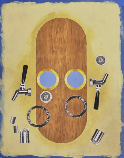
I painted the rims of the goggles with a yellowish tone that would resemble brass when finished, and a sky blue for the eyes. You have to remember that this acrylic transfer technique leaves only the toner of the laser print behind, so any area that appears white on the print will become transparent in the transfer; the underpainting determines the color of the lighter values of the transfer. I added a bit of tonal modulation in the brass rings, but that may not be necessary... I get a bit obsessive about these things.
I scanned a book of engravings to get some of the elements in this piece, and I did some internet image searching to get the rest; the beer glasses, the beer taps and the robot hands were found online. The rings of the goggles were a scan of the bottom of a can of mixed nuts...anything is fair game!
The elements here were printed on a monochrome laser printer on plain bond paper and cut out with an X-Acto knife. I laid them out toner-side up to get a sense of how the sizes were going to work.
DSC_03.jpg
This shows the elements roughly "dry-fitted" before being glued down permanently.

DSC_04.jpg
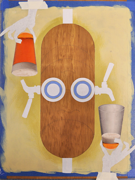
I did some Photoshop work on the beer glasses to make one look almost empty. These would be simply printed with an inkjet printer, cut out and glued on the artwork using matte medium.
I then painted a generous amount of matte medium on the panel where the black and white transfer elements were to go and also painted medium on the toner side of the cut-out prints to ensure good adhesion. The pieces were placed face-down on the artwork and were carefully burnished down using a bone folder, trying to avoid getting any medium on the back of the prints which would make the pulp removal process much more difficult. Notice I taped down the robot hand prints to make sure they would be perfectly positioned with the glass when the transfers were done.
DSC_05.jpg
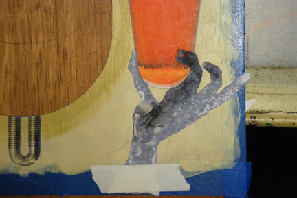
This shows the robot hands after the medium has dried and the transfer process has begun; after several hours of drying time (preferably overnight), the back of the prints are wet with clean water. Dip your fingers into the water and begin to gently rub the back of the prints. The paper pulp will begin to pill up and rub off. Continue wetting and rubbing the prints until the paper pulp has been rubbed away. It's almost impossible to get every last remnant of the paper pulp off, but if you are patient and persistent, you can get 90% of the pulp off and retain all of the detail in your transferred print. You will see that if you rub too hard, you run the risk of ruining your transfer. If you stop too soon, you will end up with a cloudy image that has too much pulp remaining.
DSC_06.jpg
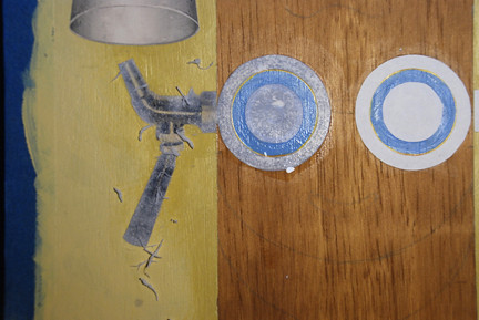
You can see the pulp that has pilled up with continued rubbing, and you can clearly see the difference in the tap, which has been rubbed for several minutes, and the goggles which have only been wet at this point.
DSC_07.jpg
The rubbing is complete; all of the elements have been transferred using the acrylic medium technique. Some areas were a bit cloudy because I was worried that I might begin to rub off the transferred toner, so I stopped a bit too soon. To counteract that a bit, you can paint a coat of matte medium and water on the transfers and they get a bit less cloudy.
DSC_08.jpg
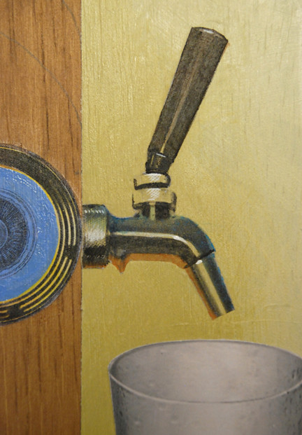
At this point, the transfers are done and the painting can begin. You'll notice that in the lighter chrome areas of the beer tap, the ochre background color shows through. In some areas that's great, because the colors all integrate with the background. But it needs some cooler colors and some highlights to look like metal, so I'm painting in some blues on top, some oranges underneath to reflect the color of the beer, and some white highlights to add some sparkle. Notice I'm trying to angle the highlight brush strokes to mimic the knerling on the fixtures. Nothing is perfect here, but why should it be? This is a painting, and the imperfections add to the character of the piece.

DSC_09.jpg
So now I'm painting the top and bottom of this robot's metal head; iron on the "down" side and brass on the "Merry" side. I painted a flat tone to begin with, and then slowly built up darks and lights to give it a hand-hammered look, with lots of imperfections. The brushwork is very loose and impressionistic. I've also painted the eyes a combination of dark blue and light blue, with black pupils and several catch lights. Note that the catch lights, or sparkles in and around the eyes line up on a consistent bias; this implies a single, specific light source and makes it look more realistic.

DSC_10.jpg
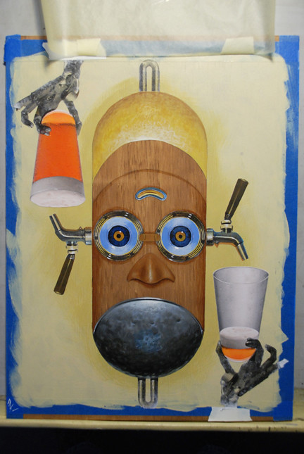
The two noses go on next; I wanted one to be metal and the other to me more retro, so I went with a leather look. The eyes seemed uninteresting, so I added an orange ring around the pupils.

DSC_11.jpg
Now it's time for the "grin". I saw this as a hinged, slotted metal piece, reminiscent of a knight's jousting helmet. Rather than try to laboriously hand paint around the the precise rectangles and the gentle gradation from light in the center to darker at the sides, I decided to make a frisket (mask) out of canary tracing paper and rubber cement. I covered most of the artwork with the tracing paper to which several coats of rubber cement had been applied, and cut out the part to be painted with an X-Acto knife. I removed the frisket and, using a 1" flat brush, quickly painted in the metal grin with shades of blue-gray. I carefully replaced that the frisket that had been removed, and then removed the rectangles that make up the slots, or "teeth" of the grin. I used thinned black acrylic ink and a 1/2" flat brush to darken those slots.

DSC_12.jpg
After the frisket was removed, I painted in the highlights on the slots, and added a rolled edge to the top and bottom of the metal grin. I also painted in some bolts on the side so the piece can swing up and down. The last step was to paint in the details of the robot hands which were not very clear in the transfers.

MerryDown_demo.jpg
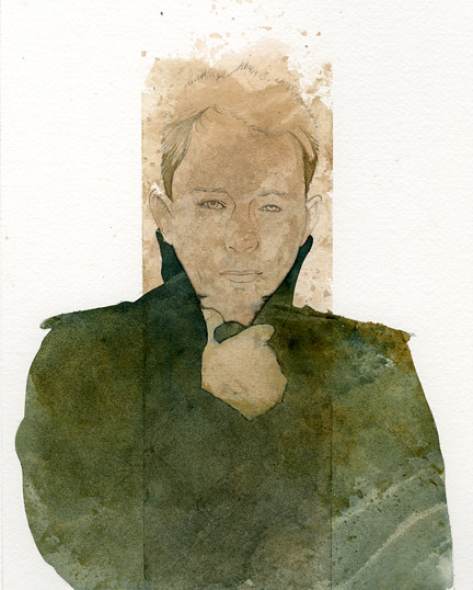
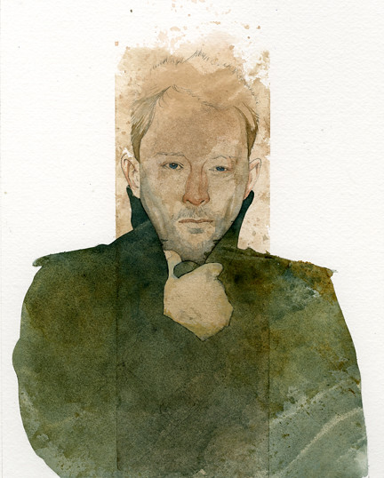
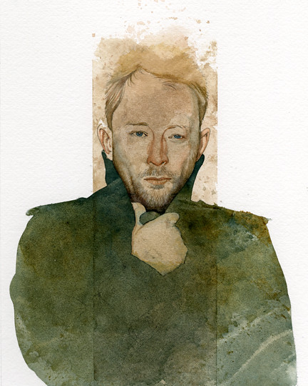
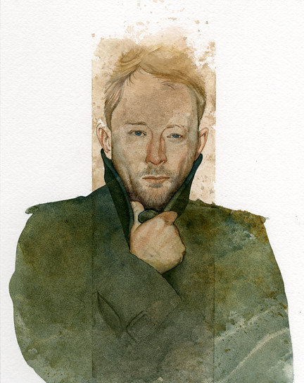
Here is the finished piece with type; this is the happy "Merry" view...
MerryDown_Down.jpg
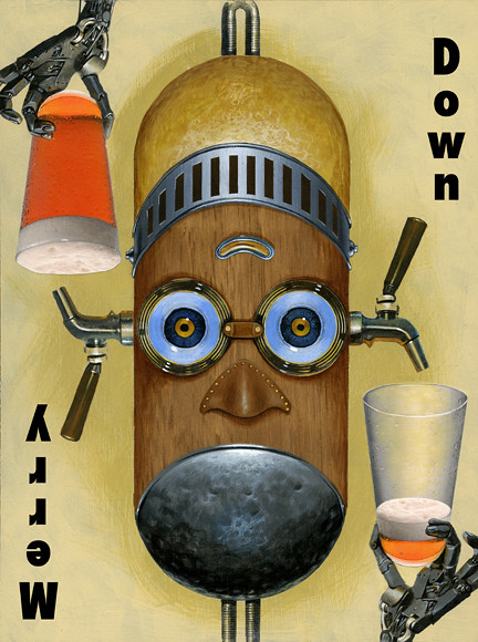
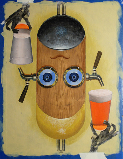
And here is the unhappy "Down" view.

Cheers!

Wednesday, November 24, 2010

Pastels: Slue Foot Sue

Slue-Foot_Sue_web.jpg
This is a demo I did last quarter for my Techniques 1 class. I didn't quite finish it in class, so I took some time this week to complete it. The technique involves using 90# or 140#cold press watercolor paper, and laying down watercolors that are roughly complimentary to what the intended final colors in pastels will be. It creates an interesting underlying color and texture that makes the piece more active and visually more interesting that the standard pastel piece on colored paper. It seems to lend itself nicely to simpler, stylized visuals like children's book illustrations.
Here are a few progress images showing the underpainting in complimentary watercolors, then the build-up of pastels over the top of the painting.
Sue_paint_steps.jpg
This is the watercolor part; the colors aren't pure compliments, just colors that are ball-park compliments, or that will simply look nice when the pastels overlay them.
Sue_pastel_steps.jpg
And this is the buildup of pastels. It's a fun process that doesn't require masterful watercolor skills to get a good result.

Tuesday, November 09, 2010

WIP: Thom Yorke

This is a demo for one of my techniques classes. It's an acrylic texture layer with watercolors for the finish work. This first state is just the acrylics (except for the darker hair at the temples which is watercolor; I was moving too fast and not scanning as often as I should)...
thom_yorke_1.jpg
I taped off the central vertical area with painters tape and loosely laid in an acrylic mixture of burnt sienna and ultramarine blue. The runny paint was pressed into the Fabriano 300# hot press watercolor paper with a piece of plastic bag ( wax paper works better but I forgot to bring it in). Lifting the plastic creates unpredictable textures and breaks in the value, leaving behind a very organic tonal base on which to paint in watercolors.
(I should have scanned it at this stage but didn't think about it until it was too late.)
Once the central area was dry, I cut a frisket of canary tracing paper and rubber cement to reveal the darker overcoat area. I repeated the acrylics and plastic bag process to create a darker textured area for the coat. I used pthalo blue and burnt sienna for a greener tint. The frisket wasn't perfect; some paint oozed under the frisket onto his chin and hand. The chin area will be quite dark so it isn't a problem, but I had to fix his hand with opaque acrylics. Not sure how that will effect the watercolors in that area...

thom_yorke_2.jpg
Here I've just begun the watercolor painting, working slowly with thin glazes of color to begin to flesh out the features and to bring out the form. All of the detail will be held within that vertical central band of darker tones.
thom_yorke_3.jpg
A bit more detail in watercolor, working slowly from light to dark, wet to dry.
thom_yorke_4.jpg
Adding some darks to the overcoat, and bringing out more of the form in the face.
Thom_Yorke_5.jpg
I went back and taped off the center column again so I can deepen the value and add more detail to the overcoat in that middle area. A bit more red in the hair, and red around the eyes, with little details here and there. This is all traditional to this point.
Thom_Yorke_Final.jpg
This is the final piece with some enhancements in Photoshop. I darkened the coat in the central area to frame the hand and face, and built some more contrast in the face with a soft light layer. I also cleaned up some ragged edges.

Friday, October 15, 2010

Asylum; WIP

The Illustration Department at SCAD-Atlanta where I teach has a club called the Illustration Asylum. This is a sketch and an unfinished color version that I've been playing with as a possible logo for the club. There is already a logo in use so I'd stopped working on it, but I was encouraged to finish it so here's what I have so far.
sketch.jpg
sketch; graphite on bristol board

I still have to work out how I'm going to handle the word ILLUSTRATION at the top.
asylum.jpg
work in progress, roughly half-way finished. Photoshop

I'll post more as it progresses.

Saturday, March 27, 2010

Rescue

lion+mouse.jpg
This piece was auctioned at an animal rescue fundraiser last year, and I'm happy to say it helped pay for having several animals spayed and neutered.
Larger version here.
Mixed media on illustration board.

Sunday, January 24, 2010

Clumsy

pelikan.jpg
There is nothing clumsier on land than a pelican. In the air is another story - dignity and grace with the attitude of a fighter pilot.

Saturday, January 23, 2010

Annibel Lee rough

Annabel_Lee_sketch_small.jpg
Two rough sketches for Annibel Lee; the one on the left shows the dead figure of Annibel framed by the moon, and standing before the sea with the wind blowing her hair. She is holding a chambered nautilus shell as a reference to the demons of the deep that await her arrival.
The sketch on the right depicts her under the water, with the demons of the deep dragging her down to their lair.
Any preference?
annabel_lee_final.jpg
This is the semi-final painting. Not sure it's done... gonna look at it for a while and then decide where to go with it.

Monday, December 21, 2009

Friday, December 11, 2009

Hatch

Hatch.jpg
Detail of a murder mystery book cover entitled "Endangered Species" by Nevada Barr, published by Harper Collins / Avon.
To see the entire piece,
click here.
acrylics on illustration board

Friday, December 04, 2009

Crunchy

crunchy.jpg
Detail from a Macy's poster I did a few years ago. It's acrylics on illustration board. To see the entire piece, click here.

Sunday, November 22, 2009

Experiment

the_boss.jpg
This is an attempt at a technique that Sam Weber demonstrated last winter at the Arts Forum. It involves doing something akin to a monoprint with acrylics, then painting the values and detail with watercolors. Mine was only marginally successful with these materials, so I did some fairly major tweaking in Photoshop.
Here are a few steps after the initial acrylic monoprint was done. It begins after a little of the face was started with watercolors. I wanted to document the acrylic part but it goes really fast and there's no time to stop and photograph it in progress.
steps_vert.jpg

Friday, November 20, 2009

Music

frog_quartet_small.jpg
This is a piece I did for a very good friend who plays violin for the Atlanta Symphony Orchestra. She runs an amazing summer chamber music program for very talented high-school kids in Atlanta called Franklin Pond Chamber Music. The group meets at her home, which is actually on a pond that is a frog haven, so the frog quartet was a natural theme. It was done entirely in Photoshop, aside from the instruments which I photographed and composited in to the artwork.

Friday, October 16, 2009

Frozen

frozen.jpg
Graphite on bristol paper with digital color.

Monday, September 28, 2009

Pattern

bird_brain.jpg
The Ivory Billed Woodpecker showed a pattern of decline for decades until it was finally declared extinct in the mid 1900's. There have been a few unofficial recent sightings in remote woodlands, and some groups are continuing to search for the Ivory-Bill, but it may be just a memory.
Of course, the checkerboard pattern of the graph also helps legitimize the image;-)

Friday, May 22, 2009

Cracked

humpty_small
Black prismacolor on coquille paper and linen weave paper with digital color.

humpty_bw_tiny
This is the black and white drawing before digital coloring. It's a bit unusual in that in incorporates two different papers to achieve the textures; the clothing, or fabric areas are done on linen-weave acrylic paper which gives a woven texture to the drawing. That paper was carefully cut out and glued on to a sheet of fine Coquille paper, which has a texture of random, raised organic shapes. When you draw on each with a black Prismacolor pencil, you get two distinct textures which can be reproduced as "line" art, meaning that it doesn't have to be converted to halftone, as a grayscale drawing would be.

Here's a close-up of the two textures:
humpty_closeup.jpg


Friday, April 24, 2009

Theater

BAB_05.jpg
Not exactly Shakespeare, but it does take place on a stage. It was done to celebrate the 100th Anniversary of the Atlanta College of Art (see the number 100 anywhere??).

Sunday, April 19, 2009

Impossible

Impossible.jpg
Pigs flying, impossible constructions, multiple points of view...all indicators of things that can not be, yet actually came to pass!
Mixed media plus Photoshop

Thursday, April 02, 2009

The Key

key.jpg
This was done as a process demo for one of my classes, and I offered it up for auction to a very worthy cause: the Art Fundraiser to Benefit the Atlanta Animal Welfare Committee. The auction/gala was this weekend... see comments below!!