Another old book cover. I know, too literal, too old school, but hey, it's a crash. And it's all I got. Sosumi. I thought about drawing Anna Nicole Smith, but that was also too literal. And just too sad on so many levels.
Click here for a larger view.
 This is a detail from a Nero Wolfe book jacket I did called "Some Buried Caesar". I don't have time for a new IF piece this time, and it's the only thing I could find that had enough red in it for this week's theme.Acrylics on Strathmore 240 illustration board.
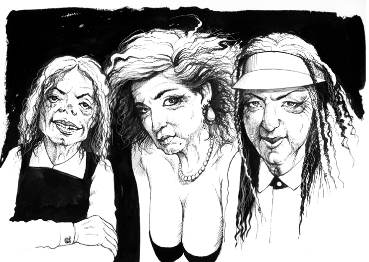
 A quick doodle of three 80's Pop icons as if in their 80's. Sadly, MJ didn't need much work to make him look decrepit.Click here to see a larger view.
 If this were me, HELP!!! isn't the only thing I'd be screaming, and a few involuntary bodily functions would likely be streaming. Dangling by one's fingertips hundreds of feet above a rocky, instant death. What fun!
 Chalk pastels on sanded pastel paper.
 This is an image I made for a book cover titled "The Heart of the Dove". It is a composite of a photograph of a piece of damask fabric and a dove I modeled in Strata 3D. Plus a LOT of Photoshop to make it look at least a little convincing. I was never that happy with the result, but it makes a logical entry for this week's theme.
 Long time no IF entries. I HATE when that happens. Just too dang busy to breathe these days. And way too busy to create something new for this topic, which has a ton of fun possibilities. But, I chose an image that isn't fun, but is appropriate for the Halloween time of year. It was done as a book cover called "Happy Birthday Murders". Hope you find the smoke to be deliciously deadly.
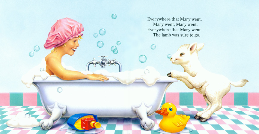
 A spread from my one and only foray into children's book illustration; a sing-along version of Mary Had a Little Lamb. The original idea was for Mary to be a border collie and all the other characters to be animals as well, and since I love doing animals, I took the commission. After I was well into the sketches for the book, the publisher called and said that a focus group felt that a dog as the lead character might frighten the children who are the target audience for these books. Mary and all the other characters had to be human children (of specific ages and ethnicities). I was more than a little disappointed and lobbied for the border collie version, but in the end the brilliant focus group prevailed over the idiot artist. That's why I now stick to doing books for mature audiences; no focus group has ever overruled my artwork (yet!).
Click here for a larger version.
Airbrushed acrylics on illustration board.
 This was for a book cover that is part of a series; the author is an ex-priest and the novels are mysteries that involve a "sleuth" priest who uncovers all manner of foul play within the Catholic church. For these covers I try to use religious icons as appropriate imagery and render them as stained glass. I grew up in the Catholic church and always loved the stained glass work in the cathedrals and churches I have been in. The original cover art lacked the spilling blood, but I think it looks better and feels more "sacrificial" with it.Photoshop
I like to ask my students to identify the product that's being advertised in this piece I did several years ago.

Give up? Windshield wiper blades! Duh! Everybody knows that Noah and the gang never would have made it if they hadn't tricked out the Ark with the very best wiper blades.
Here's the happy ending...

Acrylics on Illustration board
 No time for an original for IF, so here's my cake, marking a not-so-joyful occasion. It was done as a book cover for "Happy Birthday Murder" by Lee Harris, for Random House/Ballantine publishers.
Photoshop
 I feel uncomfortable with this post and this topic. I wish I had time to do a witty, funny take on this theme, but here's what I've got... a 20 minute sketch from a life drawing session of a very nice woman who could afford to lose a few pounds. Not funny, not witty. Just real.
 Cover art for "The Woman Who Walked Into the Sea"
by Philip R. Craigacrylics on illustration board

I scanned a page from my sketchbook and used that as the foundation for this robot figure. I am a big fan of Hajime Sorayama, who made an international name for himself doing a huge body of work with the female as robot theme, some of which are quite pornographic in nature, but all are meticulously rendered and sparkle with machinelike precision. His robots have highly polished metallic bodies, and many have flesh-and-blood faces, which gives them a softer, humanlike quality. I am attempting (clumsily, by comparison) to paint a female robot without the human face, but with a sense of humanity and warmth. I am using darker, less chrome-like metals, and textures that mimic weathered bronze, which to me feels oddly organic.
Anyway, tune in for further iterations in what may turn out to be an epic (several days) Illustration Friday entry. This is the sketch I started with.
 Spotted: Megamoviestaurs
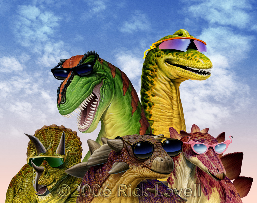
These were done for the Fernbank Science Museum in Atlanta; they were playing on the popularity of Jurassic Park and wanted to portray their dinosaur displays as stars in their own right. I tried to give the T-Rex a Jack Nicholson vibe; the others were just generic glamosaurs.
Acrylics on Illustration board and Photoshop
To see a larger version, go here.
 Slow and steady may win the race, but a jetpack is WAY more fun!Photoshop